The Samsung logo and the South Korean conglomerate, have consistently played a pivotal role in the global technology landscape. Founded in 1938 by Lee Byung-Chul as a small trading company, Samsung has grown into a world leader in numerous sectors, including electronics, shipbuilding, and construction. As the company’s profile grew, so did the evolution of its visual representation – the logo. Samsung’s logo has gone through significant changes throughout its history, each iteration reflecting the company’s vision and its ever-growing influence on the global stage.
Beginnings of the Samsung Logo (1938 – 1958)
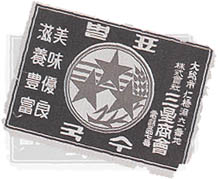
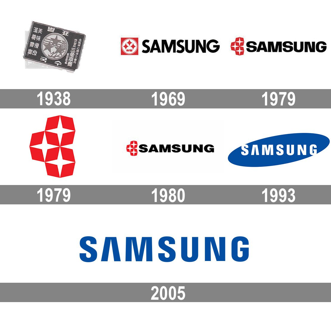
Samsung’s first logo was nothing like the minimalist design we see today. Introduced in 1938 when the company was still a small trading company, the logo was a complex circular emblem featuring three fish and three stripes inside a border containing Korean text. The fish, a kind of carp known as “Bekho,” were meant to symbolize perseverance and persistence, key qualities that were driving Samsung’s ambitions.
Transition to Simplicity (1958 – 1969)
In 1958, the Samsung logo underwent a drastic change. The elaborate fish design was replaced with a cleaner, more simplified logo. The logo was a rectangle with three stripes (resembling the earlier design), with the company name written in Hangul (the Korean script). While it was a radical departure from the earlier design, this logo laid the groundwork for the future design principles of Samsung – simplicity and legibility.
A Western Influence (1969 – 1993)
The late 1960s saw Samsung branching out beyond Korea, leading to a change in the logo to cater to Western audiences. The new logo, introduced in 1969, featured the name ‘Samsung’ in a western style, showcasing the company’s ambition to become a global brand. The Samsung word was enclosed in an ellipse, which was tilted to the right, symbolizing dynamism and innovation.
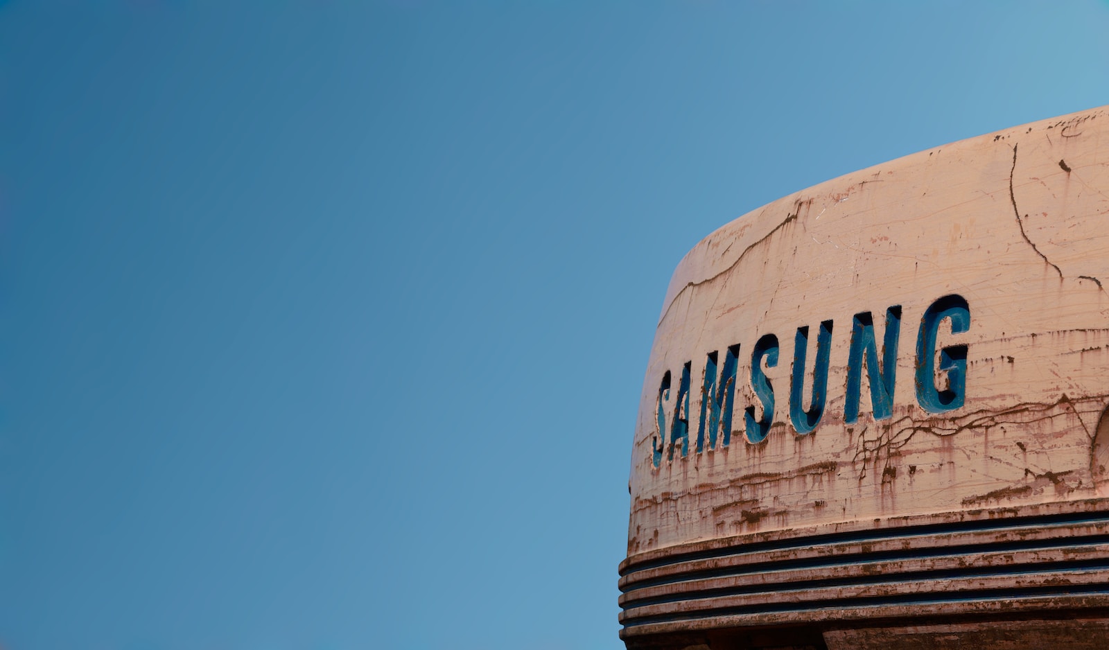
The Birth of the Blue Oval Samsung Logo (1993 – Present)
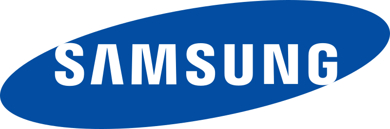
The most significant shift in Samsung’s logo design occurred in 1993. In a move reflecting its growing status as a global electronics giant, Samsung introduced the blue oval logo that we recognize today. The word ‘Samsung’ was stylized using a unique font and placed within a blue ellipse. The blue color was chosen for its representation of stability, reliability, and technology, while the ellipse was meant to represent the universe – indicative of Samsung’s growing global ambitions and its vision of being a leader in multiple sectors.
The most interesting aspect of this logo is its minimalism. It does not use any symbol or emblem, just the company name. This reflects Samsung’s belief in the power and recognizability of its brand name, implying that it’s not just a logo, but a representation of Samsung’s identity.
Samsung Logo: From 3D to 2D (2015 – Present)

In 2015, Samsung simplified its logo further. The company removed the blue oval and switched to a simpler, 2D design. The 3D glossy effect was removed, making the logo more clean, modern, and versatile for digital use. This modernized logo solidified Samsung’s image as a trend-setter in the tech industry, remaining at the forefront of design trends.
The evolution of Samsung’s logo mirrors the company’s journey from a local trading company to a global powerhouse. It has changed with the times, reflecting Samsung’s shifting priorities, expanding visions, and adaptations to a rapidly changing global market. Each iteration has held a mirror to the period it represented, marking important milestones in the company’s history. As Samsung continues to shape the future of technology, it is fascinating to ponder what the next transformation of its logo might be.
For more history about brand retailers, check out the story of Trader Joe’s and its fandom.
Leave a Reply
You must be logged in to post a comment.